Skip the primary navigation if you do not want to read it as the next section.
Skip the main content if you do not want to read it as the next section.
1. Always provide text alternatives
Images without descriptions are frustrating for users with visual impairments. The problem is even worse when people use graphical buttons to provide links. In this case, a user won't be able to use the site at all.
Without alt tags, a bit of a page which looks like this:


At a minimum, use the alt attribute of <img> tags to provide a brief description. If the image is something like a spacer gif, then add a 'null' attribute, i.e. alt="". Many screen readers, such as Jaws, also support the longdesc tag.
An example of a good <img> tag might be:
<img src="ourbuilding.jpg"
alt="image of our building"
longdesc="photograph of the front of our building,
clearly showing the location of the two
large picture windows on the right of
the door"
width="200"
height="140">

2. Don't use images as links
Designers like to use graphic buttons for links in navigation. This way, they get more control over how the page appears. Graphic buttons can certainly look better than text buttons - if you can see them.
The previous example shows how badly a graphical navigation can go wrong if you omit alt tags. However, even if you douse alt tags, such buttons are best avoided.
People who are partially sighted may find it easier to view text at a larger size than the default. Nearly all browsers allow you to increase font sizes to a preferred level. However, image-based links can't be resized using the same approach. The following screenshot shows a news box with enlarged text, but with a graphic title which can't be resized:
3. Avoid fixed sized elements
Using graphics to represent text is a major cause of irritation. However, there are lots of other opportunities to annoy people trying to resize the text on a page. The main culprit is font size: never use fixed font sizes for text, as it prevents users from being able to change it to suit their needs.
Instead of something like
<span style="font-size:20px">Hello</span>
You should instead use relativeunits of measurement, such as:
<span style="font-size:110%">Hello</span>
or
<span style="font-size: 1.2em">Hello</span>
To test your site for this problem, try putting the text size setting on your browser to its largest setting, and see what happens to the layout.
4. "Click here" syndrome
When people use assistive technologies to scan a page quickly, they often just skip over the links, looking for things that interest them. Links with the text "click here" are a waste of time.
A bad example might be:
To see our terms and conditions, click here
This might be better expressed:
Please read our terms and conditions
5. Allow users to skip navigation
Site navigation is often the first thing to be read on any page a screen reader. Imagine having to skip manually over a list of 15 links on every single page you visit before you get to the content.
You can make it easier by providing links to skip long navigation sections. If you like, you can hide these links from your other users by making them the same colour as your background, or by using CSS:
<a href="#content" style="color:white">skip navigation</a>
<a href="/Home">Home</a>
<a href="/AboutUs">About Us</a>
<a href="/History">History</a>
<a name="content"><h1>Welcome</h1></a>
6. Choose colours carefully
Some visually impaired users find it easiest to read yellow text on a black background, and others prefer black on white. Whatever they prefer, you are certainly doing no favours to these users if you choose something like yellow on pink.
There is also range of visual impairments related to colour perception, the most well known being the various forms of colour blindness. Picking red text on a green background for your navigation might mean that up to 10% of men might not be able to read it.
Visicheck URLis a useful online tool for simulating colour blindness.


7. Avoid frames
Frames are irritating to navigate when using assistive technology. To get an idea of how they might appear, have a look at this screenshot of the Health and Safety Executive website, which uses frames, and compare it with the output from the text-only web browser, Lynx:
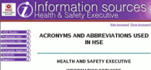
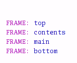
HSE site in a text browser
If you must use frames, then make sure you give them meaningful titles. "Top" and "bottom" are not useful; better might be "main site navigation" and "page copyright information".
8. Avoid pop-ups
Try to avoid anything happening automatically on your site. Events which occur without the user asking for them are confusing without the aid of visual prompts. Automatic pop-up windows are particularly bad, as they may move the keyboard focus away from the main screen, making it hard to return to the text.
If you mustuse pop-ups or new windows, only allow them as a result of a user action (e.g. clicking on a link), and warn your users clearly that this may happen. One place you can put a warning is in the title attribute of a link:
<a target="_new" href="http://www.site.com"
target="_blank"
title="Site (opens in new window)">
A site</a>
9. Describe your site
Scanning a site visually is a much quicker process than scanning it with a screen reader. Give textual signposts for the benefit of those using screen readers.
For example, the important sections of your site may be highlighted with coloured backgrounds on your home page, but this information is not available to everyone. To orient visually impaired users, it can be very helpful to provide a page describing the general layout and features of your site.
Providing a site map with a short introduction is probably the best way to meet this requirement. Site maps are a standard way of displaying all the information available on your site in a logical overview. Furthermore, studies have shown that users always find them intuitive to use.
10. Don't rely on Javascript
Many users browse with Javascript turned off. Even if they don't, most Javascript effects are purely visual, and rely on you pointing at certain parts of the page with your mouse. This is not much use if you don't have a mouse.
When they encounter a site with a Javascript-based popup menu, people who use keyboards for navigation may be completely unable to access most of the information on the site.
The best solution is not to use menus like this at all. If you mustuse Javascript, try using your site with Javascript turned off. You should always be able to navigate to any page without Javascript.